Case Study · ATReview
Turning manual audit trail reviews into a real-time, exception-based workflow.
Pharmaceutical QA teams were spending days reviewing audit trail data in spreadsheets, manually checking thousands of records and still only covering a fraction. I designed ATReview from zero to launch brand identity to usability testing delivering a validated, compliant product that reduced review effort by over 80% and achieved 100% critical event coverage.
01Context
No product, no spec, no visual identity. Just a problem worth solving.
Audit trail review is one of the most demanding compliance tasks in regulated pharmaceutical environments. Every change made to a GxP system must be traceable, reviewable, and defensible to regulators. Most companies were managing this in Excel: periodic exports, manual filtering, and enough volume that full coverage was simply impossible.
A competitive analysis confirmed the opportunity. Every tool in the space was built for compliance, not for people. Dense interfaces, punishing navigation, visual design that felt fifteen years old. These products existed because QA teams had no alternative not because anyone had designed them well. That gap became a deliberate direction from the start.
Orise Digital's ask was direct: build a tool that digitises audit trail review from the ground up automated, continuous, and compliant. I joined at the very beginning.
| Area | My ownership | Type |
|---|---|---|
| Discovery & research | Competitive analysis, stakeholder interviews, domain immersion in GxP compliance and ALCOA+ principles | Mine alone |
| Brand & visual identity | Logo, colour system, typography built from scratch to feel trustworthy yet distinctly modern in pharma software | Mine alone |
| UX & interaction design | Information architecture, role-based dashboards, review workflows, exception-based filtering model | Mine alone |
| Usability testing | Two rounds with 10 participants across QA, operators, and system owners baseline to 9.6/10 | Mine alone |
| Feature design (Bulk Update) | Benchmarking, four solution concepts, user testing before build, final guided-flow implementation | Mine alone |
| Engineering & QA automation | Front-end build, back-end integration, automated test coverage collaborative with engineering team | Shared |
Process notes
Three things about how this work got made that don't fit inside the numbered narrative.
I was the only designer on the project across the full 12-month engagement. My collaborators were a Product Owner, a Front-End Engineer, a Back-End Engineer, and a QA Automation Engineer. All design decisions from brand identity to interaction patterns to usability testing were mine. Engineering decisions were collaborative, and I made sure the QA Automation Engineer joined stakeholder sessions from the start so user scenarios could feed directly into end-to-end test coverage.
21 CFR Part 11 and ALCOA+ requirements aren't typically treated as UX inputs. I treated them as the primary design brief. Every interaction that touched a regulated record submitting a reason for change, approving a review, mapping an unattributed user had to produce an immutable, timestamped, identity-verified audit entry. The compliance requirements shaped simpler flows: when every action is captured and verified by design, the interface becomes the source of truth.
There were no existing users to observe just QA professionals describing a process they'd done for years without questioning it. Stakeholder interviews surfaced what surveys wouldn't: the real anxiety wasn't the volume of records, it was the fear of missing a critical one. That insight reframed the entire design direction.
02The Problem
Nothing in the existing process could prove a change was routine without a human manually verifying it.
Before ATReview, QA teams managed audit trail reviews the only way they could: manually, periodically, in spreadsheets. A single GxP system could generate thousands of log entries in a review cycle. Teams would export the data, filter what they could, and review as much as time allowed.
Volume made full coverage impossible
Sampling is not reviewing. Critical events could and did fall through the gaps. The larger the company, the worse the problem. Teams reviewed what time allowed and hoped the critical events were in the portion they checked.
Thousands of raw log entries per review cycle · Manual filtering in Excel · Full coverage structurally impossible at scale
Excel couldn't satisfy ALCOA+ in practice
The data integrity standard requires every record to be Attributable, Contemporaneous, Legible, Original, and Accurate. Spreadsheets couldn't enforce any of it. Generic shared accounts made attribution impossible. Retroactive entries broke contemporaneity. Records could be altered with no trace.
ALCOA+ · Attributable, Legible, Contemporaneous, Original, Accurate none enforceable in a shared spreadsheet environment
Regulatory audits meant scrambling
When an inspector arrived, teams had to reconstruct activity manually across scattered files and forms. Stressful, slow, and entirely reactive. The root cause wasn't that reviews were slow it was that every entry had to be treated as suspicious because the system had no way to say otherwise.
Manual reconstruction across scattered files · No always-on audit trail · Entirely reactive compliance posture
03Key Decisions
Compliance constraints became design constraints, not legal footnotes. Five design decisions shaped ATReview. Each one came from treating compliance constraints as design constraints not legal footnotes to address after the interface was built.
Review by Exception make routine events invisible
Role-based dashboards, not a universal view
Visual identity built from scratch and made intentional
User scenarios written with engineering, not after them
Knowing what not to build
03.5Early Concepts
Initial explorations before the final direction
Before landing on the final solution, I explored several directions for the parameter changes workflow from rough sketches to early UI concepts.
 Concept 1
Early concept: Parameter Changes flow
Excalidraw sketch exploring the initial information architecture and navigation patterns for the parameter changes view
 Concept 2
Early concept: Relevant parameter changes
Early exploration of the Relevant Parameter Changes table, visualising record changes alongside their status
These explorations helped clarify that the core problem wasn't displaying data it was helping users understand which changes were relevant to their current review task.
04Solution
A continuous, exception-based workflow that replaced the spreadsheet entirely.
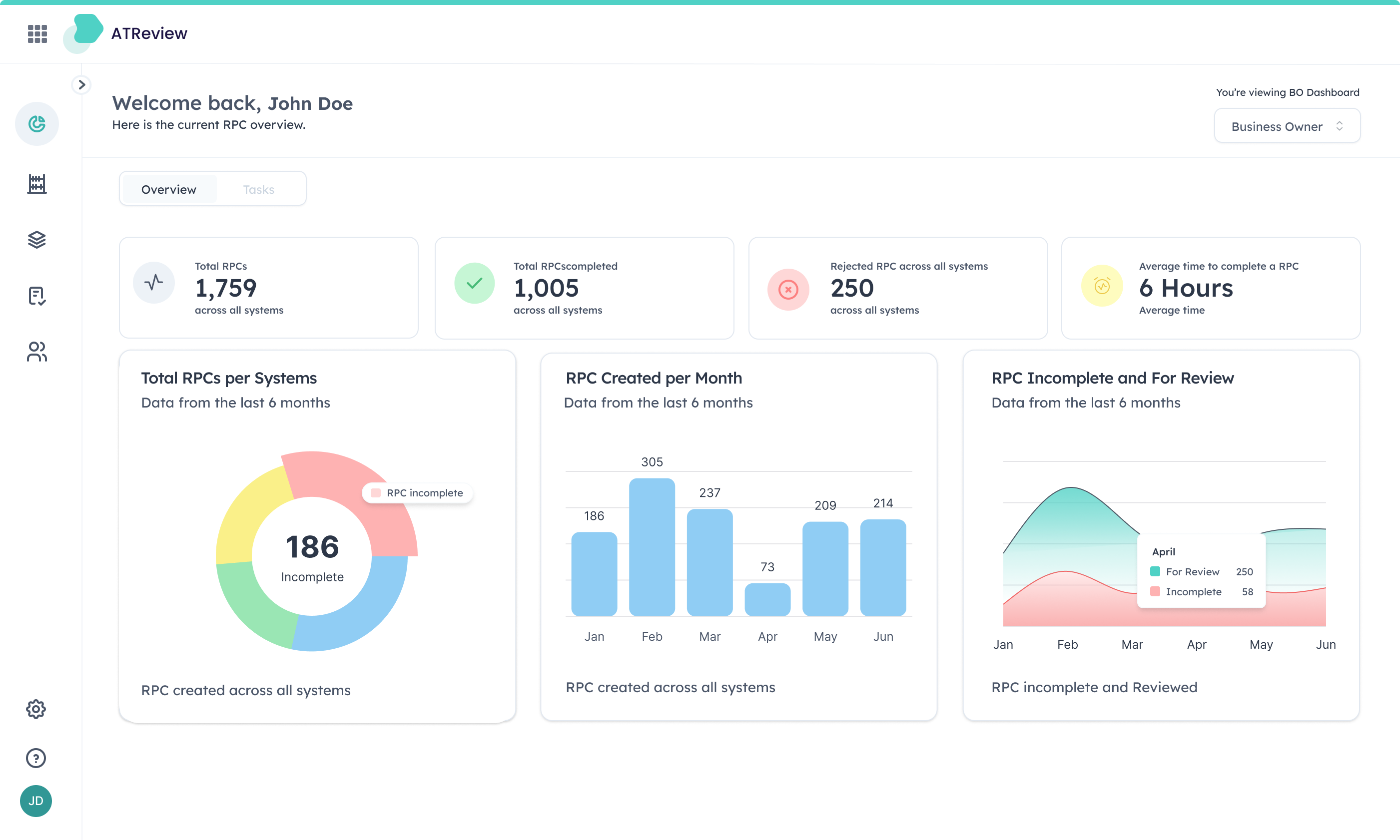
ATReview transforms audit trail review from a periodic, spreadsheet-driven task into a continuous, exception-based workflow.
A GxP system generates a change event
ATReview classifies it against the configured Risk Assessment
Routine events are filtered automatically QA never sees them
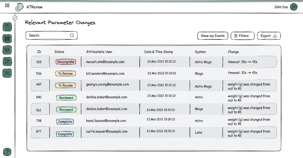
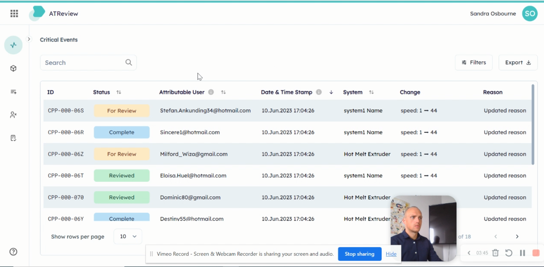
Relevant changes surface in the review table
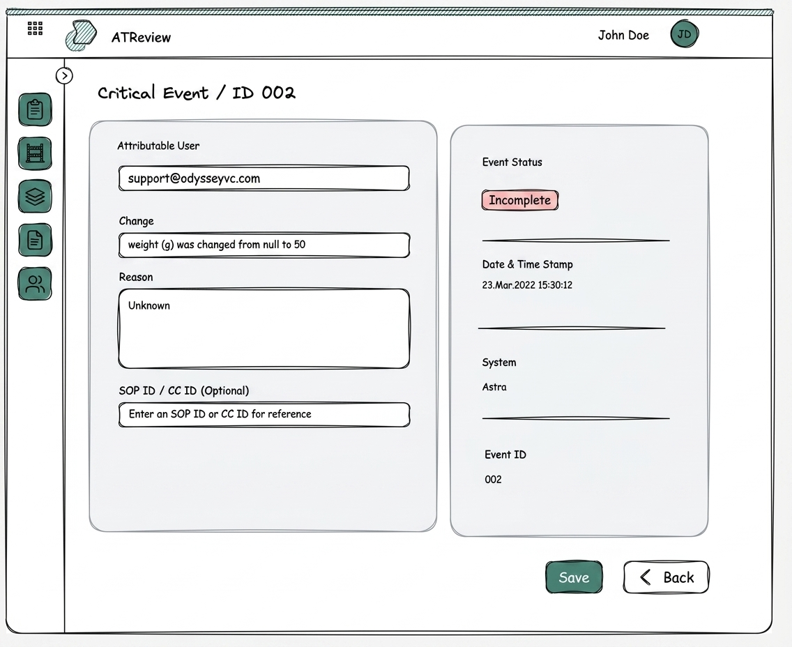
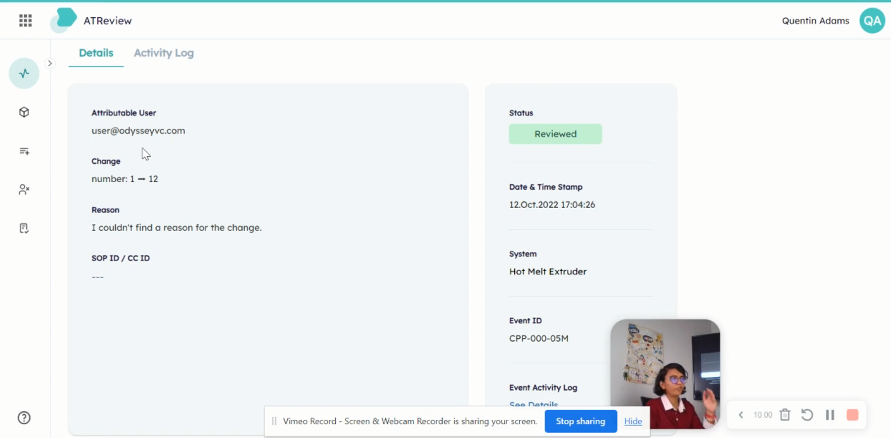
The operator adds context: what changed, why, with their verified identity and a timestamp
QA receives a notification, reviews the record, approves or rejects
Every action is logged immutably: user identity, eSignature hash, timestamp to the second
Each change moves through four states, with role-based handoffs and rejection loops built in at every stage.

Exception-driven focus the visualisation centres on what's incomplete and needs attention, not what's already done.
Role-aware lens QA and System Owners see the same underlying data through different views shaped by their workflow.
'Relevant' already means the noise has been filtered status badges make workflow state scannable at a glance without opening individual records.
Exception-based review QA only sees what requires human judgement, not every log entry the system generated.
ALCOA+ met through one well-designed input operator's reason tied to their verified identity and timestamp.
Read-only change data visually distinct from operator fields QA can trust data integrity without cross-referencing source systems.
System actions logged identically to human actions ATReview itself is audited the same way users are.
Always-on, instantly auditable no manual reconstruction when an inspector arrives.
Usability testing
10 participants across QA engineers, operators, and system owners. Initial score: 7.8/10. Post-iteration: 9.6/10.
 Session 1 of 5
Task: Review and triage critical events
Participant: Compliance officer navigating the events list, applying filters, identifying incomplete records
 Session 4 of 5
Task: Complete an incomplete event record
Participant: System owner locating the event detail, entering reason text, referencing an SOP ID
Both tasks revealed the same friction point: participants couldn't tell if an event was actionable by them or assigned to someone else. This became the primary design problem for the status model.
05Impact
Purchased by a pharmaceutical company after seeing it in action, now Orise Digital's core product.
ATReview was purchased by a pharmaceutical company after seeing it in action. It is now Orise Digital's core product, with active plans to deploy across a Tier 1 pharmaceutical company's systems.
“The application was very easy on the eyes, very easy to see what was changed, and very nice and beautiful to navigate. We're not used to modern, well-designed UIs in pharmaceutical software, and we were very impressed by how the information was laid out and how easy it was to see exactly what needs to be done.”— Client, Pharmaceutical Company
06Reflection
Compliance isn't something you layer on top. It's something you embed into every interaction from the start.
When ALCOA+ principles become design constraints rather than legal requirements, the result is simpler for users and stronger for auditors. Those goals aren't in tension they reinforce each other. Every interaction that touches a regulated record was designed to produce an immutable, timestamped, identity-verified audit entry. That meant designing for auditability at the interaction level, not bolting on a log at the end.
The Bulk Update feature reinforced something I now apply consistently: testing before building is not slower, it's faster. The time spent validating a design upfront is always less than the time spent fixing a shipped feature that doesn't work for users.
I'd formalise the competitive analysis into a living benchmark that updated as we iterated not just a one-time discovery artefact. The initial analysis was sharp, but by month eight the competitive landscape had shifted and I was relying on memory rather than documented reference points. A quarterly refresh would have kept positioning decisions grounded.
“The interface that earns trust in a regulated environment isn't the one that shows the most data. It's the one that proves it's already handled the data you don't need to see.”